← back to projects

Visual · UX · Systems
Scalable icon system for Headout's product experiments
Built a grid-based icon system with 80+ icons and usage guidelines, replacing a patchwork of third-party sets with a foundation the team could extend as the product grew.
- Icons
- Systems
- Product
A patchwork of third-party icons
Headout's product experiments and new feature developments required a consistent, scalable icon system. The existing library was a mix of third-party sets, inconsistent in style, hard to reuse, and slow to extend when new categories launched.
Ad-hoc icon creation meant uniformity drift across the product. Every new category brought new visual debt, ambiguous shapes, inconsistent weights, mismatched optical sizing.
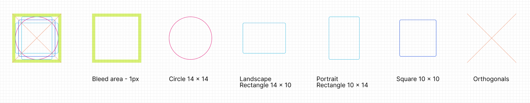
Reverse-engineering what worked
I ran a comparative analysis of icon libraries, Material, Salesforce Lightning, and similar open systems, to identify common approaches to keyline, stroke weight, and grid.
Reverse-engineering existing icons revealed a latent 2×24 grid with uneven stroke weights. I refined it into a 16×16 system optimized for small interface contexts, then defined keyline shapes up front so proportions stayed harmonious across the set.
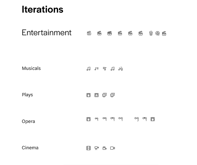
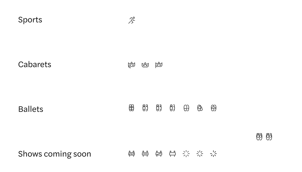
A library built to scale
Standardized strokes, corner radii, and negative space kept the set uniform without feeling mechanical. Usage guidelines followed, so the next person picking it up could contribute without introducing drift.
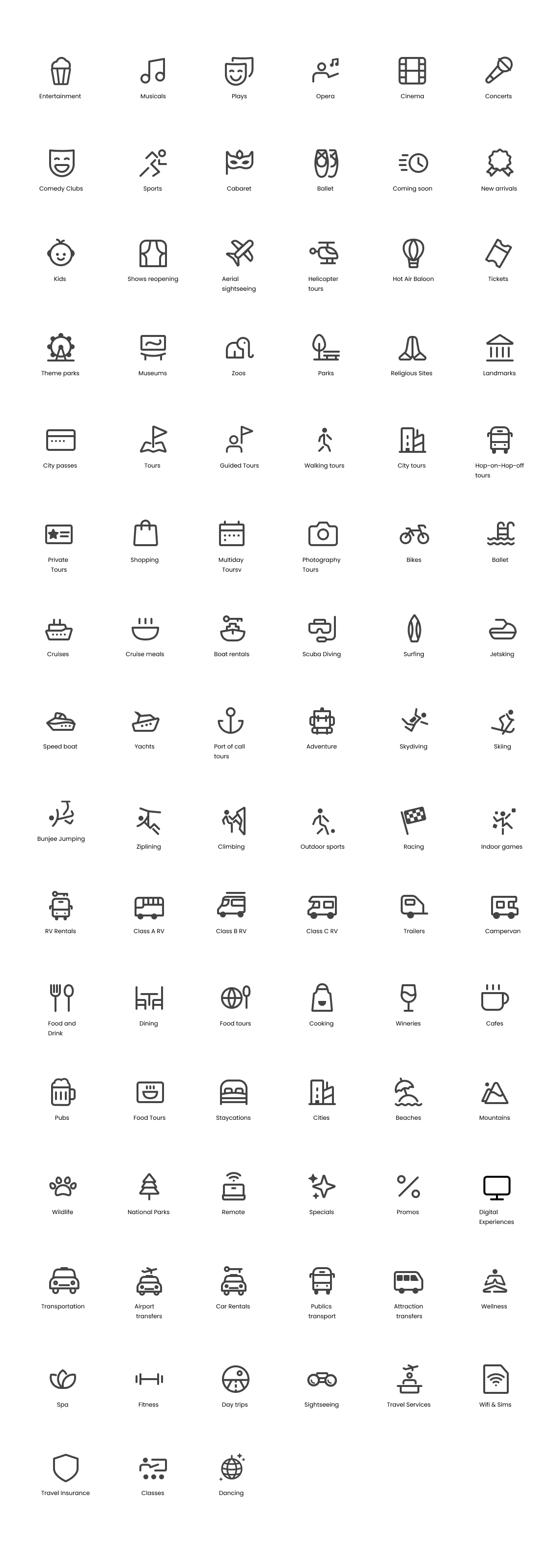
What shipped
The system launched with 80+ icons across emerging product categories. Guidelines reduced long-term dependency on third-party libraries and gave the design team a reusable foundation for every new launch.